2024 Color of the Year
The 2024 Color prediction season is in full swing as paint brand after paint brand announces its pick for Color of the Year (COTY). Below are the announcements from the brands and what we know about them. Absent are Benjamin Moore, Sherwin Williams, and Farrow & Ball, which we’ll add as they become available.
2024 Color of the Year Picks
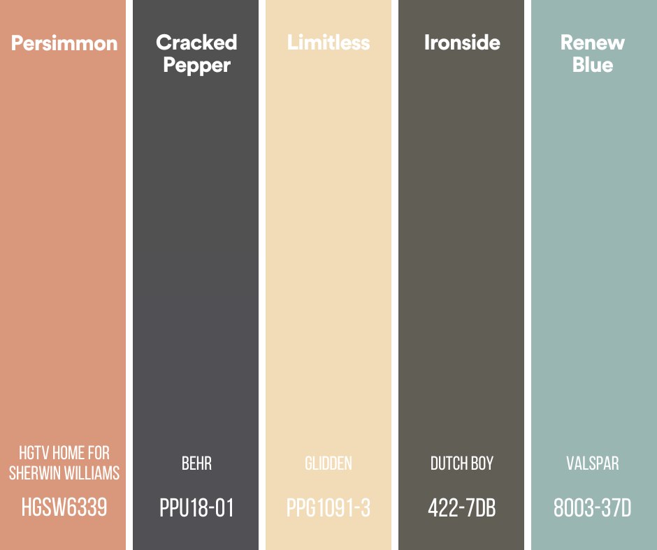
Here are the choices from HGTV Home for Sherwin Williams, Behr, Glidden, Dutch Boy, and Valspar.
HGTV Home by Sherwin Williams
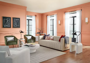
HGTV Home by Sherwin Williams announces a Color Collection each year and this year, Persimmon, an earthy terracotta, is the cornerstone. “Persimmon pulls from grounded, earthy origins, to deliver a shade that feels both uplifting and refreshing. An earthy terracotta infused with tangerine tones, naturally inspired colors like perfect Persimmon are being incorporated to soften spaces and add a personal touch to the home.” Check out the entire collection online with examples of mixing and matching.
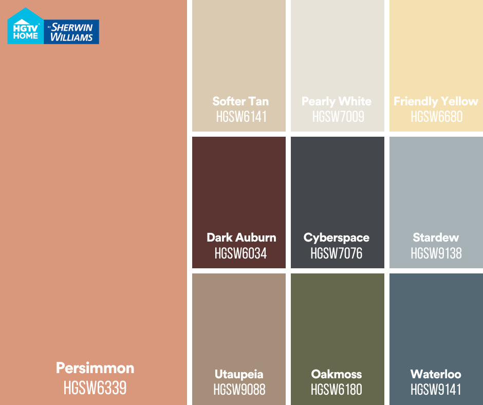
Our take on Persimmon
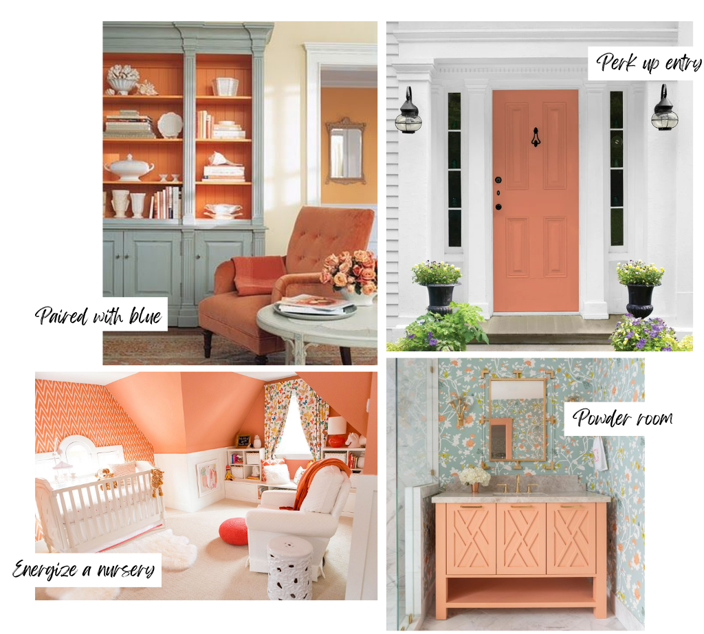
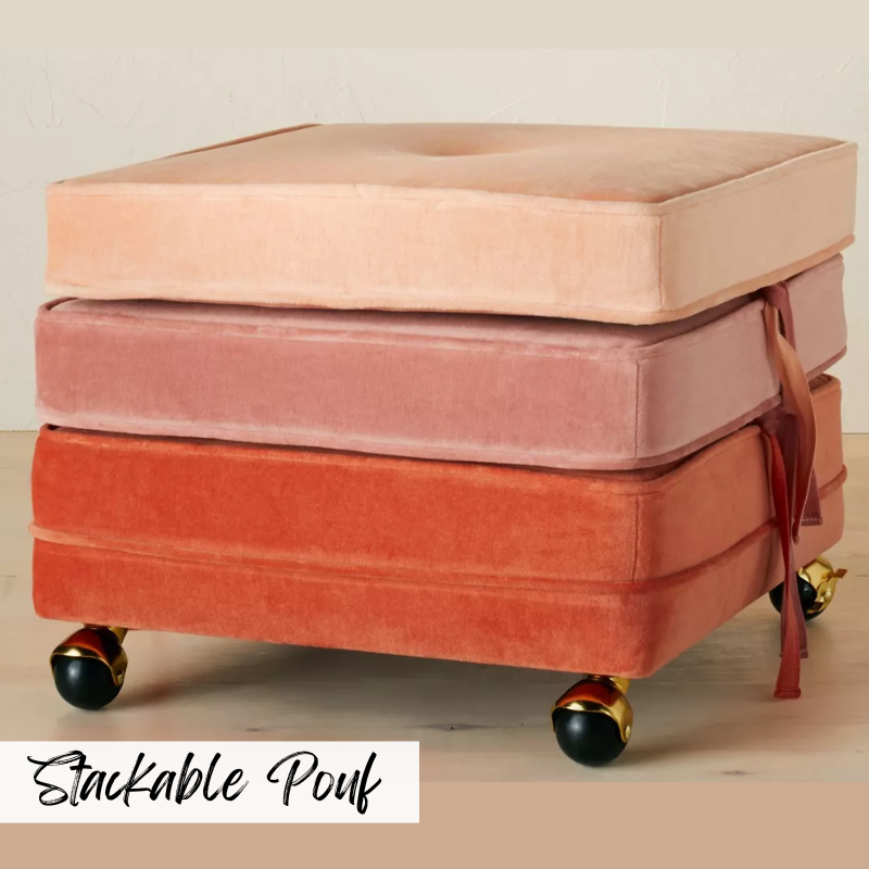
Over the last couple of years we’ve seen a resurgence of earth tones like terracotta as the trend towards nature continues. Persimmon does carry more punch than a muddy terracotta and we like it paired with dusty blue/gray and on front doors. It is a nice alternative to pink in children’s rooms. In a powder room it can read sophisticated and fun with the right finishes.
Behr
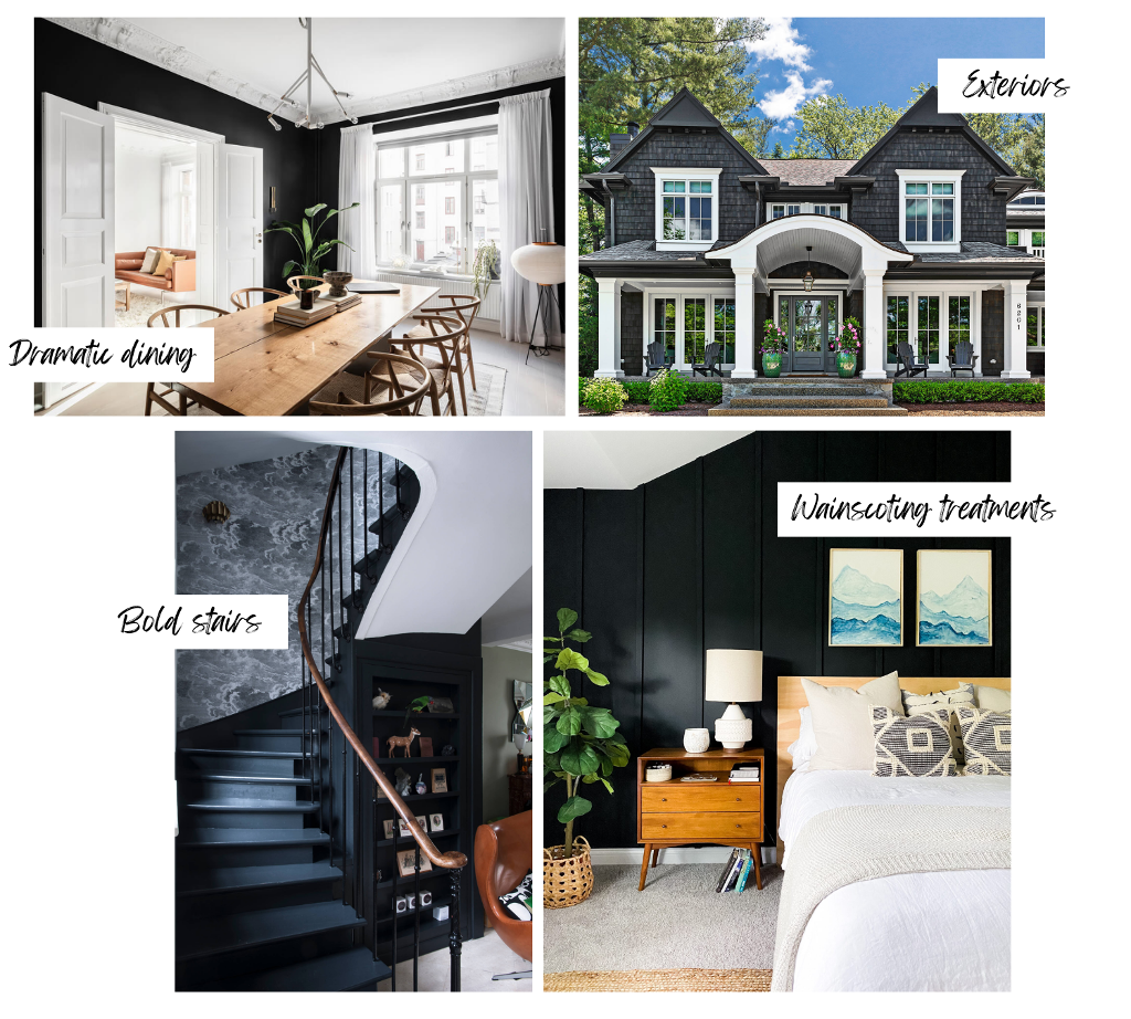
Behr’s COTY is a versatile soft black called Black Pepper. It is a stark contrast to Behr’s 2023 COTY Blank Canvas, which was a neutral, off-white. The 2024 color is an edgier neutral for those ready to add depth and intrigue to a space. It works well with everything from dusty pastels, earthy shades, and bold patterns and textures. It works well on exteriors too.
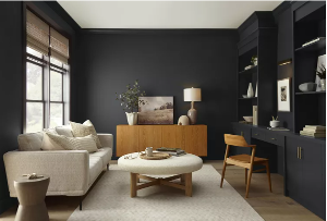
Our take on cracked pepper
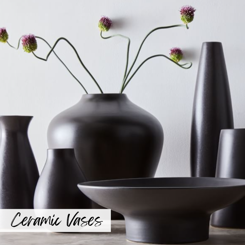
Another color that we’ve seen variations on over the last few years. Cracked Pepper (similar to Sherwin Williams Cyberspace) makes a space feel modern, luxurious and refined. It can be intimidating. Finding the right balance is critical, because too much can feel ominous. Lots of natural light, tall ceilings – those help balance this strong neutral. Using natural wood elements and gold metallic accents will add warmth. Consider it for kitchen cabinets or furniture pieces you may be refinishing.
Glidden
Glidden describes its creamy beige 2024 pick Limitless as “a fresh warm hue that holds both the power of a primary color and the essence of a neutral”. It pairs equally well with warm and cool tones. “Warm neutrals are here to stay, replacing cool tones like gray for both DIY and pro segments in 2024 and beyond,” said PPG color expert for the Glidden brand, Ashley McCollum.
our take on Limitless
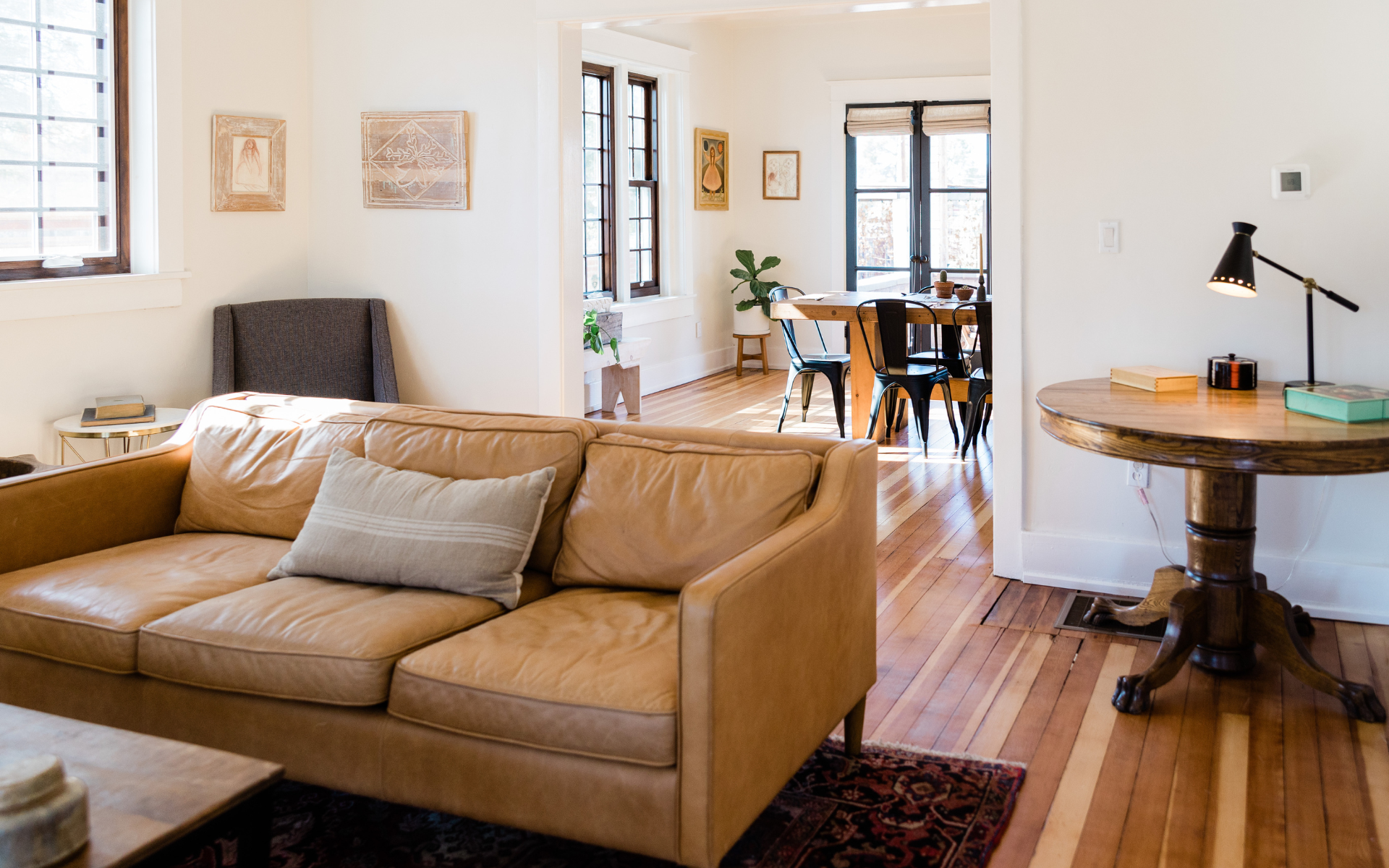
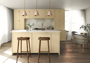
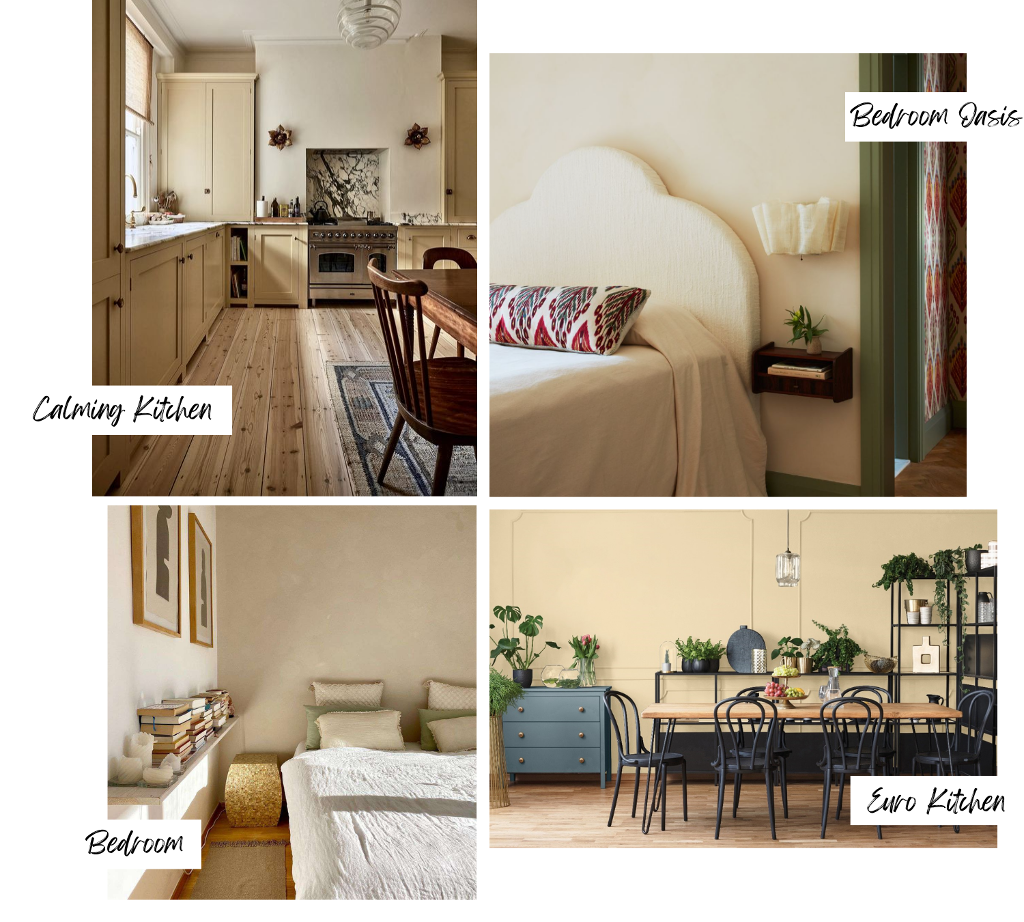
Glidden emphasizes in their PR that this is not a yellow beige. In their photos, Limitless reads yellow or even pink, depending on which monitor I’m using. However, in real life it may be creamier and lovelier. Finding a good creamy warm neutral that doesn’t read too yellow is HARD. I always suggest you sample a few and live with them for a week, checking them at all times of day. For example, Samplize offers peel and stick paint samples from several manufactures and is well worth it. Below are some neutral beige colors, with the bottom kitchen photo actually being from Glidden.

Dutch Boy
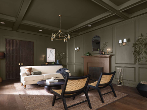
Rooted in comfort, Dutch Boy Paints’ 2024 Color of the Year is a deep olive green shade called Ironside. Described as “soothing and reassuring” by the company, Ironside’s black undertones help give the hue a rich dimensionality. It’s one of the brand’s One-Coat paints, all of which were designed to provide full color coverage with just one coat of paint.
our take on ironside
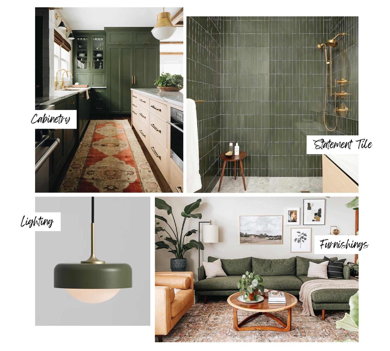
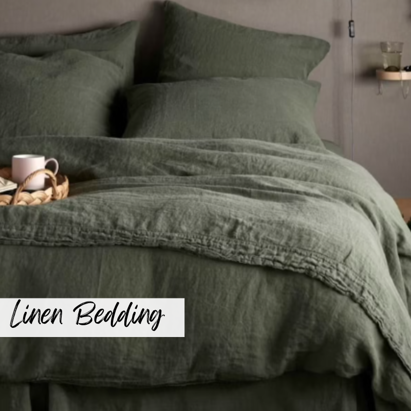
This direction towards earthy colors continues with this dark olive hue. We can’t get enough of this green. It feels very rooted, yet modern in the kitchen. In a bathroom, it can read as a soothing neutral. (I dare you to name a color that wouldn’t look great with that tile below.) We love it for furnishings and accent pieces. More. More. More.
Valspar
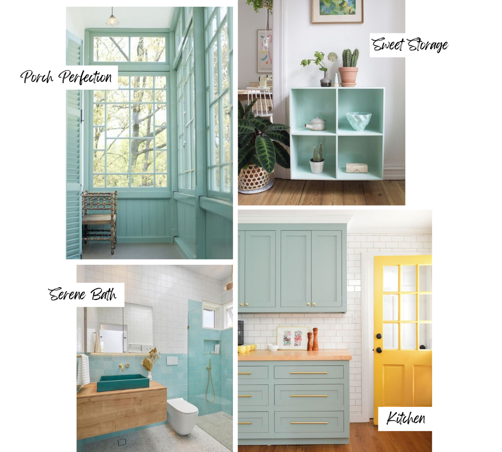
Valspar announced Renew Blue as its 2024 Color of the Year. It is a soothing blue with green undertones. “With a renewed focus on self-care and personal well-being, homeowners are looking for ways to make their dwellings uplifting places to relax, recharge, and entertain,” explains Valspar’s director of color marketing, Sue Kim. This blue is a classic that is adaptable and will work with nature-inspired designs.
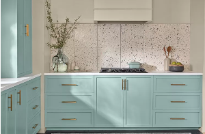
our take on renew blue
Much of the press on Renew Blue included a living room with walls, accessories, and furnishings drenched in the hue and it was overkill – too minty sweet. However, when balanced with the right amount of white and/or natural elements it is a show stopper. We are seeing a lot of light blue in kitchens right now.
Will you consider any of these in an upcoming project? If you are thinking of selling your home soon, you may want to consider freshening up the paint. In fact, you can expect 107% ROI for new interior painting and a 55% ROI for exterior painting. Neutrals work best when selling, but we can help you with a pre-consultation, because every home is unique. Contact us today with questions.


