
Posted by Andrea Durway
Paint Color Trends 2018
Throughout the summer the paint trends for 2018 were trickling out across the internet. We began to see a turn from the all white trend to warmer and darker tones. Since Dawn and I have been in various stages of home renovation projects over the last 12 months (me a kitchen and bedroom, her an entire house) we thought we would share our take on current paint trends.
SHERWIN WILLLIAMS – OCEANSIDE
Just this week, Sherwin Williams announced Oceanside as its color of the year. “People today have a growing sense of adventure, and it is making its way into even the coziest corners of our homes,” says Sue Wadden, director of color marketing at Sherwin-Williams. “We are craving things that remind us of bright folklore, like mermaids and expeditions across continents. Oceanside is the color of wanderlust right in our own homes.”
Our Take: We like this blue because it pairs so nicely with both white trim and with historic woodwork and wood floors. It is a color we don’t tire of – a new neutral. My master bedroom has been a similar peacock blue color for almost three years. Dawn recently added teal accent cabinetry in her white kitchen. Bottom line – we’re fans!
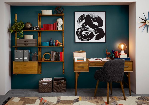
Home office from one of our 2017 listings rocked a blue wall similar to Oceanside.
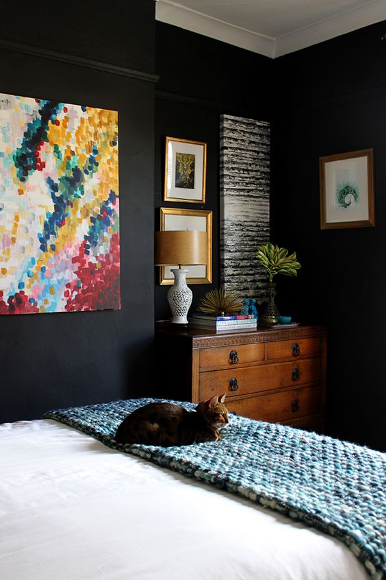
PITTSBURGH PAINTS – BLACK FLAME
Pittsburgh Paints named Black Flame as its color for 2018 describing it as a “sophisticated, unexpected neutral [that] fulfills craving for comfort, privacy and hope”. This plays in contrast to the long run of white we’ve been seeing. It follows the trend towards darker and richer colors.
Our Take: We like these dark inky colors best when contrasted with white and warm woodwork. I’ve used a similar color, Benjamin Moore’s Wrought Iron, for the doors in my white kitchen and a buffet in my kitchen. I’m considering it for my master bedroom makeover becauase I love it so much. Dawn is using a dark accent wall in her master bath with black and white concrete tiles. Not quite finished, but it looks amazing. Bottom line – we love it as long as it is balanced with white and/or lots of natural light. 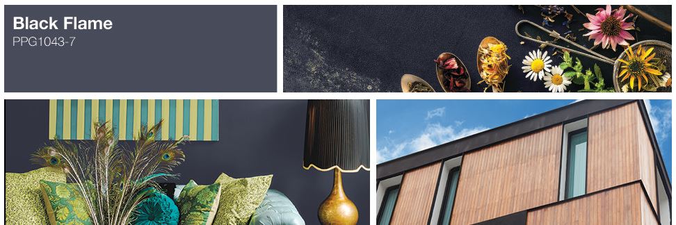
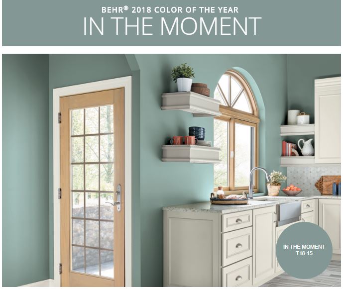
BEHR – IN THE MOMent
This is the first time Behr has announced a Color of the Year. In The Moment is a soft blue gray that, “speaks to our society’s desire to disconnect and be present,” said Erika Woelfel, vice president of color and creative services at Behr. “It crosses multiple design styles — global, coastal, modern — and pairs well with other subdued colors to create harmony for interiors or exteriors.”
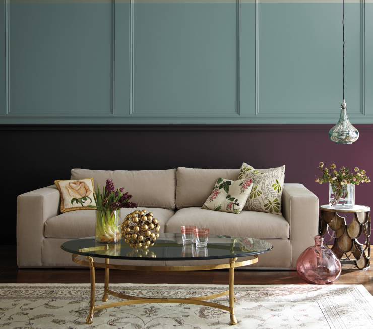
Our Take: We think this color would appeal to a lot of buyers. Blue is a perennial favorite and this one steers towards gray, rather than a baby blue. I tend to think it works better paired with darker colors (like the blue door and dark plum below). The master bathroom in our 1960’s ranch has all the original blue gray tile work. We haven’t gutted it yet because we don’t mind the color and it is in excellent condition. Bottom line – a safe bet, but make sure to balance it out with strong accents.
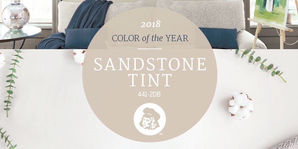
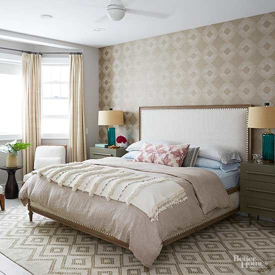
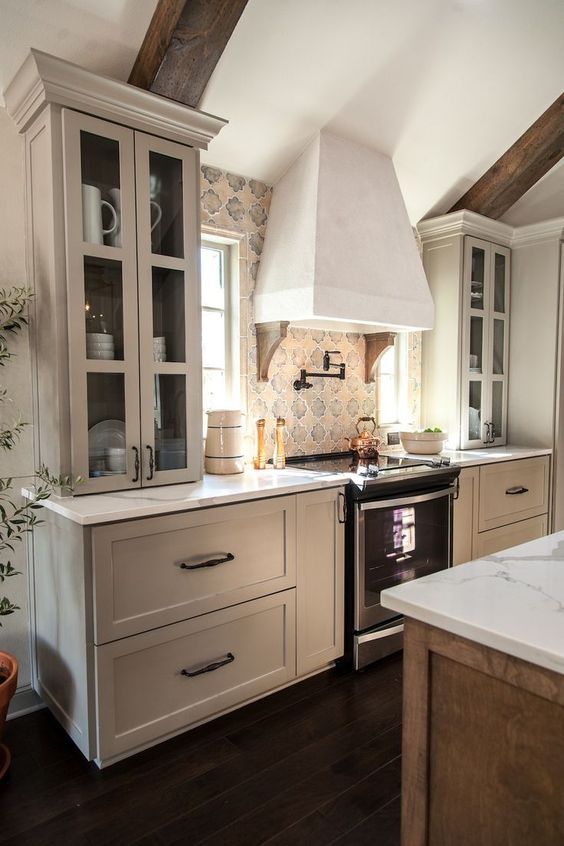
DUTCHBOY – SANDSTONE TINT
Dutchboy chose this greige — a.k.a. a blend of gray and beige — for its 2018 color, which is somewhat of a surprise because the greige trend has been around for a while now. According to the company, it’s “a hue that nods to the simplicity of the past, while also making a modern, color-confident statement that looks to the future.” This shade is part of Dutch Boy’s “Quest” palette, which features earth tones that are “as classic as they are sophisticated.”
Our Take: This is a go-to neutral for a lot of the renovations we see in real estate. It has wide appeal for good reason. It is calming, soothing, and an easy choice for today’s open floor plan homes. To keep it from being boring, add lots of textured and patterned elements in the room — think tile, woven shades, chunky rugs, wooden shelves. I used a similar color, Benjamin Moore’s Revere Pewter, in our kitchen when we moved in to neutralize the dark cherry cabinets until we were ready to totally rehab the kitchen. Bottom line – greige is here to stay. It is a timeless choice that works in a wide variety of situations. Add pops of color and texture to add interest.
summary
We are eager to see what Benjamin Moore, Pantone, and others name as their Color of the Year. Stay tuned for more and if you are thinking of selling your home soon, you may want to consider freshening up the paint. Neutrals work best, but we can help you with a pre-consultation, because every home is unique. Contact us today with questions.

